DESIGNER ROLE:
UX Designer | Researcher | Information Architect
TOOLS:
Balsamiq | Adobe Photoshop | CMS
project:
ArtsWestchester (formerly known as the Westchester Arts Council) was looking to have a complete website redesign. My role as UX Designer and Content Manager was to successfully guide the organization through the website overhaul process.
CHALLENGES:
There were a variety of challenges involved in this project. A few of them are listed below:
• Website was originally split into two different websites contained within one domain which made navigation extremely confusing and counter-intuitive. (This meant two different homepages with two different navigations)
• The digital team was only comprised of three people, including myself.
• Inefficient use of space. Web width only occupied 80% of full screen despite there being an immense amount of information content.
• Navigation and web layout were not user friendly.
TARGET AUDIENCE:
• Artists
• Art Organizations
• Supporters
• Education
• Families
• Art Organizations
• Supporters
• Education
• Families
INFORMATION ARCHITECTURE:
While working for ArtsWestchester, I spearheaded the redesign of their website by restructuring the site’s information architecture, providing guidance and technical support to other departments throughout the process, and optimizing our content to better fit our wide-ranging audience.
In the original design, the website was split into two different websites contained within one domain which made navigation extremely confusing and counter-intuitive - This also resulted in two different homepages with two different navigations. The main goal of this task was to better understand the services provided by ArtsWestchester, and who those services were being provided to, in order to better unify and present the content of the website.
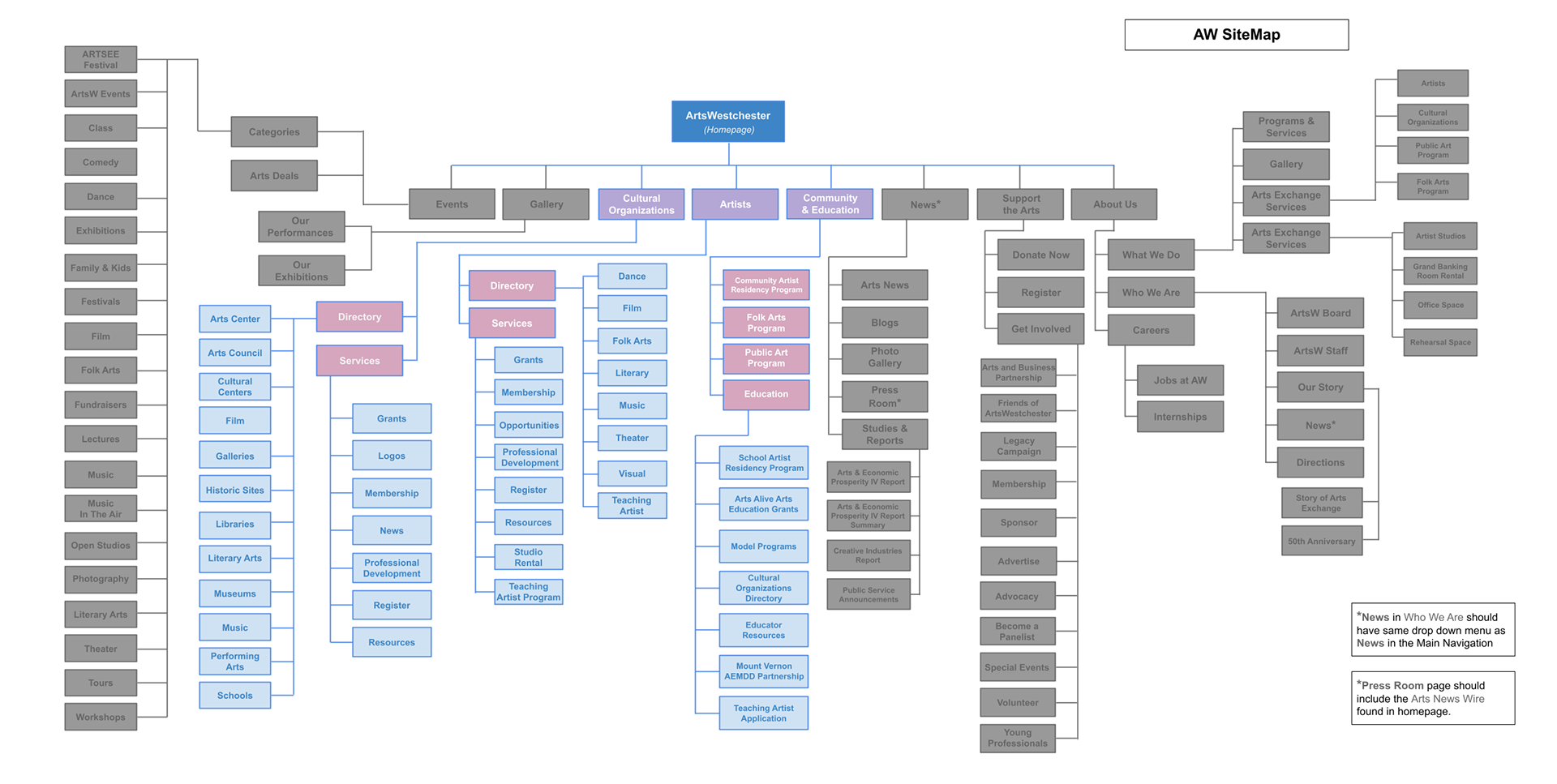
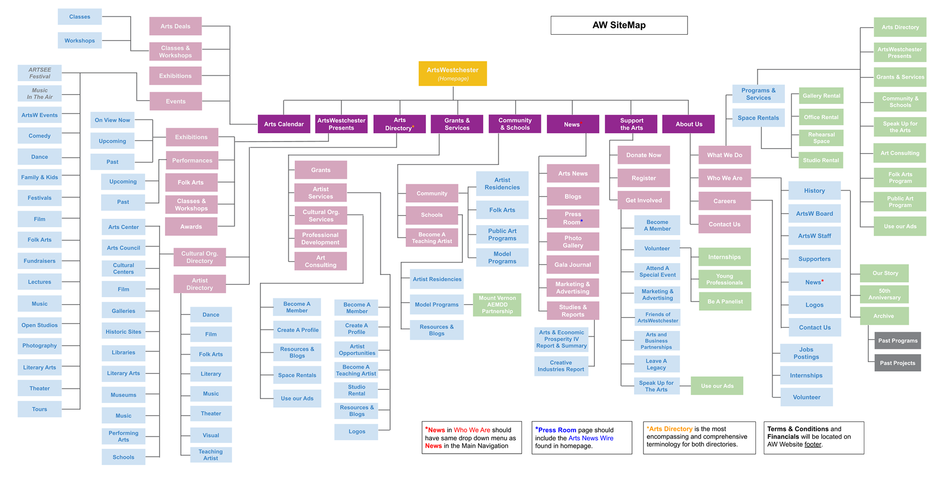
In my initial version, I used gray colors to indicate the content from one site being incorporated into the other site map, in order to have a single map that included all of the services ArtsWestchester offers their different audiences, and in preparation of unifying all of the content into one single website. I went through several iterations of the site map, incorporating user research and collaborative decision-making by all departments to finally arrive at the last version of the site map:
DESIGN PROCESS:
After getting a solid grasp of the information architecture, and having a final draft of an improved site map, the next step required creating numerous UX deliverables such as sketches, wireframes, and flowcharts among others. During this process I advised management on best practices for user-centric designs and interactions.

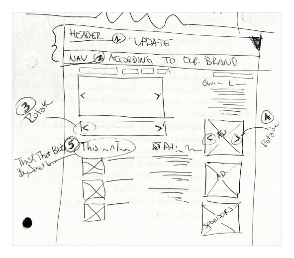

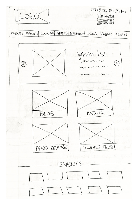
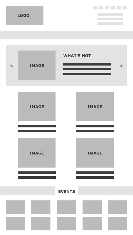
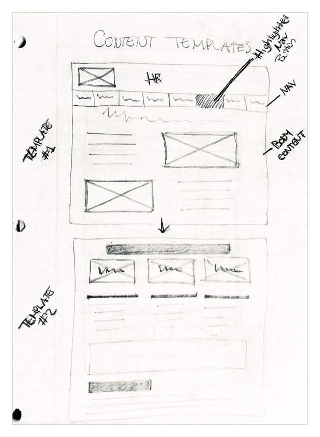
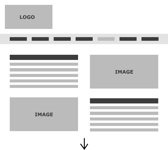
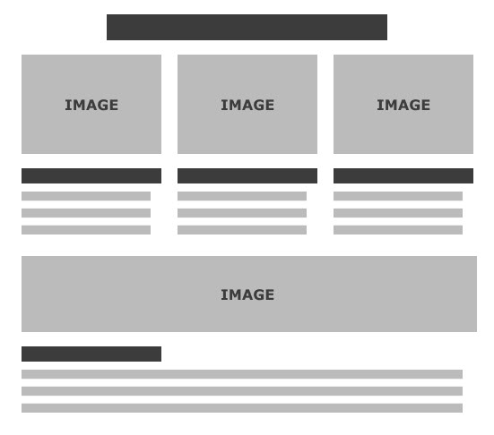
LO-FI WIREFRAMES:
• Outlined blueprints for how the updated content would be laid out in the new site
• Helped communicate how the new structure would facilitate navigation and information discovery for our users
• Came up with possible content placement based specifically on target audience priority.
• Helped communicate how the new structure would facilitate navigation and information discovery for our users
• Came up with possible content placement based specifically on target audience priority.
SOLUTIONS:
Solving some of the previously mentioned challenges involved consolidating the two "websites" into one all encompassing one. It required restructuring the entire layout and information architecture of the website as well as re-evaluating some of the organizations' main services and goals. This also meant having to prioritize certain functions over others, and having all organization departments come to a consensus about which aspects of the non-profit needed to be highlighted and which should take a back seat. The new website is up and running, helping promote artists’ work all over the county, as well as spread cultural events and workshop opportunities all throughout Westchester NY.
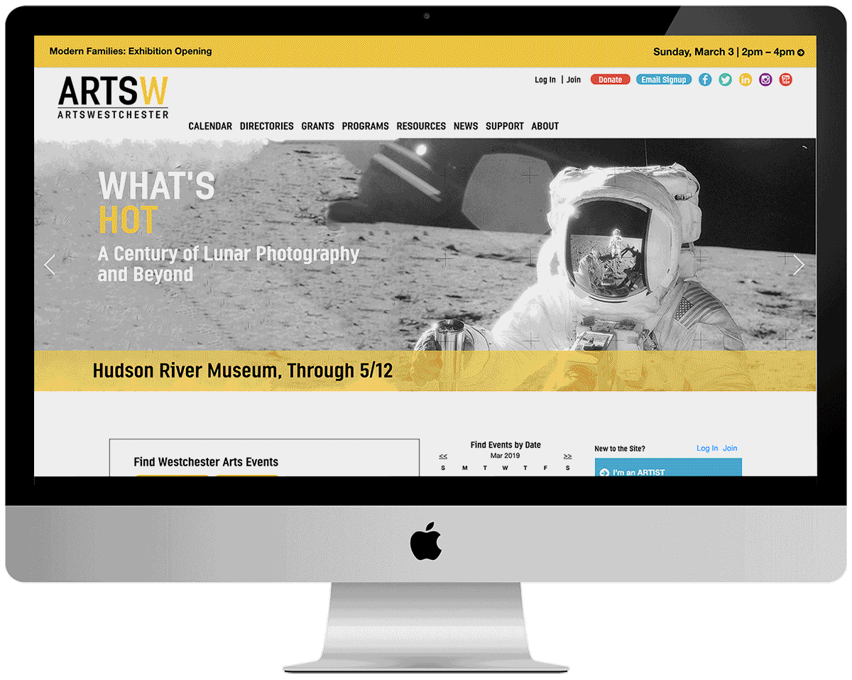
BEFORE & AFTER:
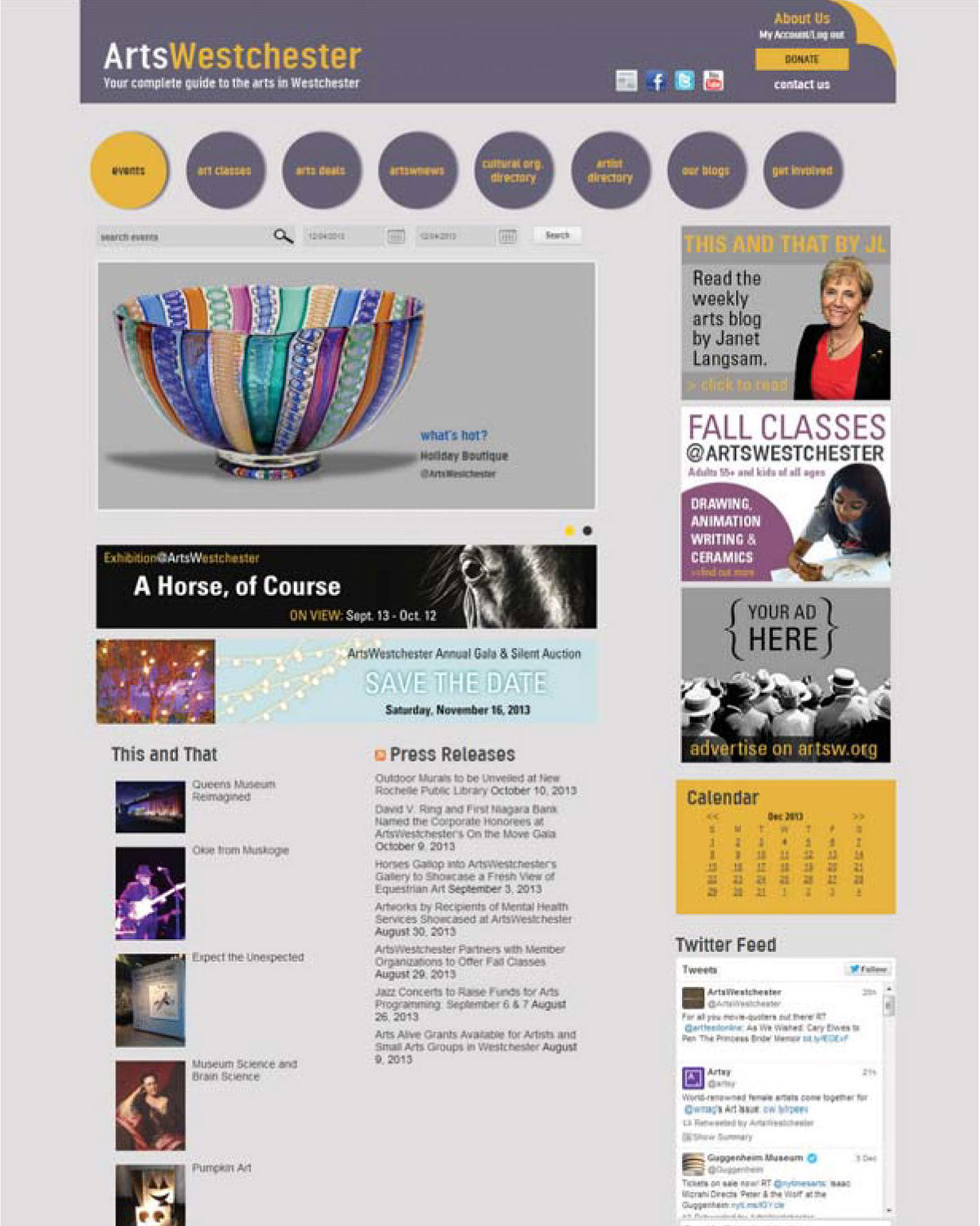
• Website originally split into two different homepages with two different navigations.
• Web width only occupied 80% of full screen despite large content amount.
• Navigation and web layout confusing and not user friendly.
• Web width only occupied 80% of full screen despite large content amount.
• Navigation and web layout confusing and not user friendly.
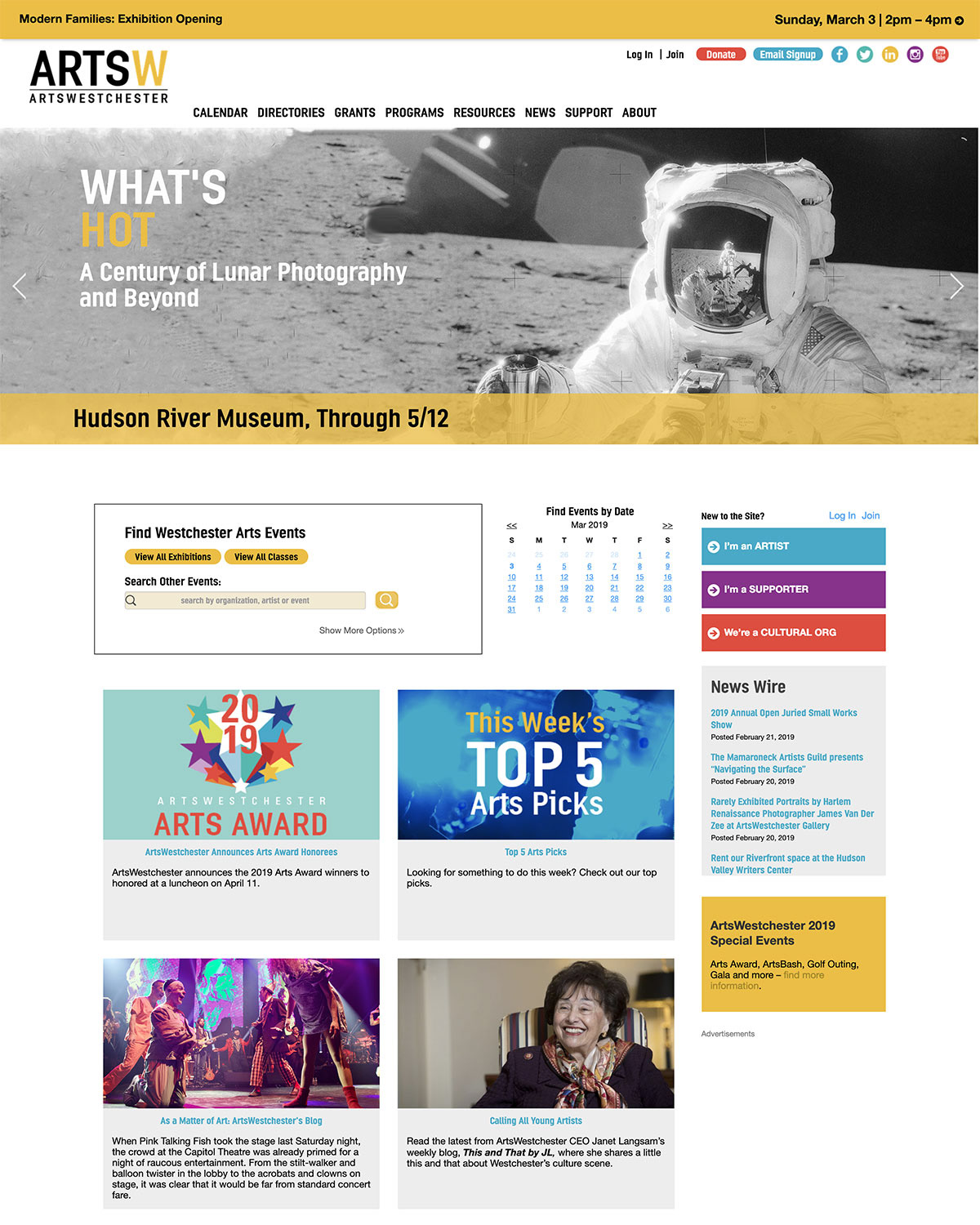
• Website consolidated to one overarching homepage and navigation.
• Content layout updated to make better use of digital real estate available.
• Information architecture optimized and navigation updated to improve user paths and better meet user goals.
• Content layout updated to make better use of digital real estate available.
• Information architecture optimized and navigation updated to improve user paths and better meet user goals.

