PROJECT:
The School of Liberal Studies & Continuing Education held a contest for whoever designed the best promotional poster to announce the Purchase 2014 Summer Session Courses.
CHALLENGES:
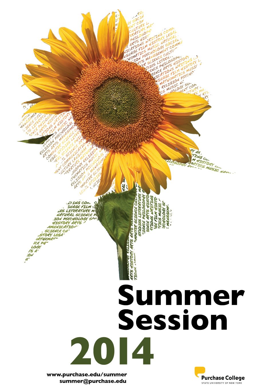
Requirements for entries specified displaying the Purchase logo on the poster, the course site url, and the contact email address. Additionally, the poster needed to convey a clear message through its imagery, while maintaining aesthetics and simplicity. Other than that, the design approach was entirely up to whoever wanted to participate in the contest.
At the beginning, the unrestricted nature of the task seemed like an obstacle in itself. There's so much you can do with a blank canvas. Where do you start? How do you approach it?
SOLUTION:
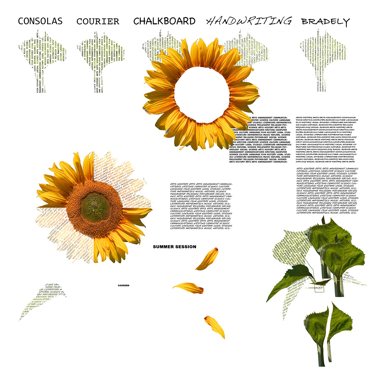
The first and best step I took in starting this project was deciding to focus on a single element that would effectively portray the idea of summer.
After much debating, the sunflower seemed like the most appropriate symbol. Generally sunflowers bloom during the summer, and their flower also resembles the sun, thus its name. With sun and water, the flower blossoms. This can also represent the educational growth that can be provided by college courses. Once I established the main theme for the poster, the rest of the work-process flowed more naturally.